Digi-Pack Production
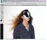
our Digi-pack was made up of an Album Cover/case and a promotional poster they have both influenced each other but have very different production process. we started with our album cover/case. when producing our Digi-pack we wanted to stand out form other cases and also keep to our genre roots of being New and exciting. therefore we decided to develop our own case out of card instead of using a plastic case with paper insets. first we sketched ideas about how it would look and came up with a simple Single case it would have an insert with music a font and back cover and a slot of a CD inside. we also did a Photoshop in a studio to get the image fro the rest of our Digi-pack. but his was hard because we didn't have everyone we needed for the shoot so we decided to have fill ins and with editing we could make them look like the characters from our music video.


|
though out our digi-pack production we used Photoshop this is because we had access to it and it is a goof software to use but also because it is an industry standard and we could get a good result using it.
|
|

|

|

|
we first looked at taking screen shots from out video footage for the digi-pack but the image were of a low resolution and also to small to make a full sized case. so we decided to go out and start doing a photo shoot. our first look was to get shots of trees to symbolic the forest.we took RAW images to get the best quality. but had a problem with converting them straight on to the MAc and had to convert them on my personal computer and transfer the file (now a JPEG) to the Mac.
after editing these shots we then had images for our insert and inside covers but we wanted to add more of the character form our story in to the art work. so we decided to have a photo shoot with our actors. |
bur most of them weren't free so we diced that because they were wearing the mask we could fill there places with people who were similar and hope we could edit it to look the same as out original actors. we then looked back on our research in to intertextuality and wanted to use the same course scheme that we had found from other texts such as Miami Hotline, Drive and Inherent Vice. (CLICK HERE TO VIEW INTERTEXUALITY BLOG)
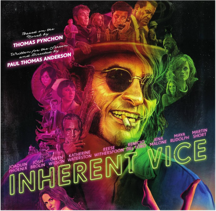
Inherent Vice DVD / Blue Ray Cover
|

Our Album Cover
|
moving onto looking at information for our back cover of the album and our promotional poster - this would be stuff like the bands record label/logo the terms and conditions of the album and what remixes are available in the single. we first looked at the original single cover and found the remixes made for the single - when used them on our back cover.
|
when then moved on to looking in to the record label. we know that they were a company called mute so we diced to email them to see what they though of our product. they replied saying they were happy to do this for our education and would love to see the whole final product they sent use a logo we could use and the trims and conditions that would need to be on the back of our mock up cover.
Moving on to our promotional poster we wanted to carry on the theme that we had sorted on the album cover we decide to use the murder and only him crouching down similar to a tiger staling his prey. we then wanted to add information such as; reviews, information about release date, where they can download or buy the single and band and record label logos. |

|

|
when looking for reviews we diced to look on iTunes and with online downloading sites for music. this gave use an example of what audience though of the music but not of what institutions had rated it. we then looked though all the top music view sites to get the rating we have on the promotional poster. when developing this poster we wanted to take in to account where it would be placed taking in to account our target audience

we then decide that seeing as there educated and middle class they would probably be traveling from city suburbs to the city center this could be for work or to go to education such as university. we would place it in train stations.
here are some example that it might look like when they are advertised. |

|

|
